10 Principles of Effective Logo Design
What Makes a Logo Truly Successful?
Over the years, we have learned that designing a logo is not about personal taste or following what feels current. A logo is not decoration. It is a strategic business asset that carries the identity of a company across every touchpoint, from packaging and signage to digital platforms and advertising.
The primary considerations in creating a trademark, symbol, or icon remain consistent regardless of the industry or era. Immediate identification and clear visual definition are always the goal. A successful mark must communicate what a company represents, and in some cases, suggest how it works. It must hold its presence in an increasingly crowded marketplace where consumers are exposed to thousands of brand impressions every day.
Most logos fail because they are designed with short term thinking. Trends may feel safe since many brands use the same visual style, but this often causes brands to blend together rather than stand out. What feels modern today can quickly become outdated. At the same time, some logos fail because they are overcomplicated. Designs that look impressive in a presentation may lose clarity when reduced in size or applied to real world materials. Simplicity is not about following trends. It is about clarity, adaptability, and memorability.
A successful logo does more than look modern.
Below is a practical checklist of ten essential principles that guide the creation of strong and lasting brand symbols.
10 Principles Checklist
Click each principle to expand details and examples.
A logo must stand out within its environment and provide quick, memorable identification. It should hold its presence whether placed on packaging, signage, or digital platforms. A useful visual test is imagining the mark within a visually noisy environment such as a busy metropolitan street or a competitive retail shelf. If it disappears into the clutter, it needs refinement.

A strong logo must function across multiple technical applications. From high-resolution screens to embossed packaging, embroidery, or heat stamping, the mark should remain intact and recognizable. If a logo cannot withstand various production methods, it will struggle in real-world implementation.
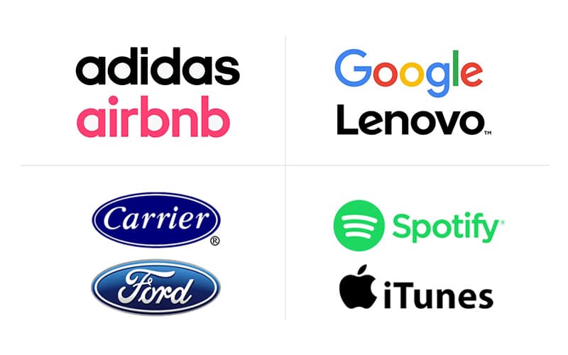
A logo must clearly distinguish itself from competitors. Similarity is not only a branding issue—it is a legal one. Many trademark disputes are decided based on how closely a mark resembles an existing competitor. Distinctiveness protects brand equity and reduces long-term risk.
Is the concept easy to recognize? Overworking a design often reduces clarity. At the same time, thoughtful refinement can enhance readability and memorability. The goal is balance: simple enough to be understood immediately, but considered enough to feel intentional.
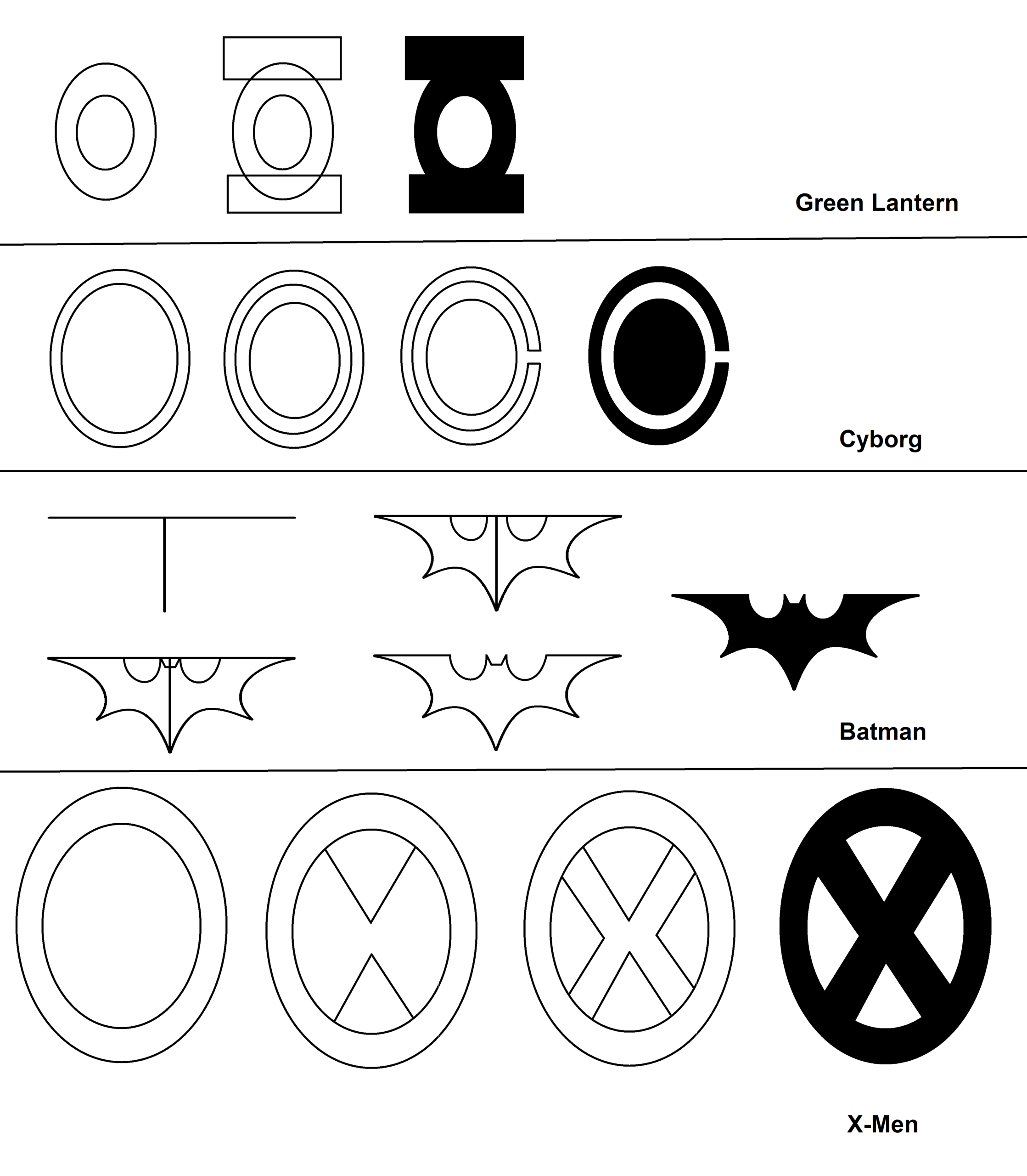
Memorable logos invite a small moment of discovery. They allow the viewer to engage and internalize meaning.
Designing in black and white first is best practice. A successful mark must function without reliance on color. Many production technologies such as photocopying, faxing, blind embossing, or single-color printing cannot reproduce subtle color nuances. A strong logo must hold its integrity in any format.
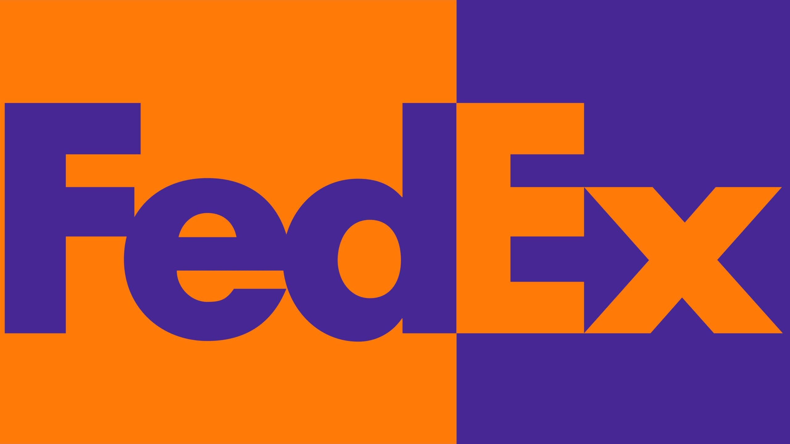
A symbol should hint at the nature of the company or product without being a literal illustration. Strong logos suggest rather than explain. Literal translations often limit flexibility and longevity.
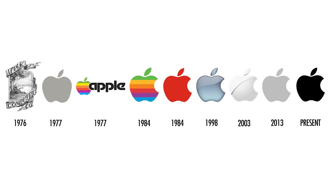
Trends have short life cycles. While design evolves, chasing current aesthetics can quickly date a brand. Historically, trademarks were expected to last 15 to 20 years. Today, some identities turn over in five years or less. Even so, designing with restraint rather than trend dependency increases longevity.
A logo rarely exists alone. It lives within a broader system—typography, layout structures, color palettes, and brand assets. All elements must work together as a unified voice. A strong symbol can be weakened by inconsistent supporting typography or graphic treatment.
Brand equity, the accumulated recognition and trust in a mark, is a powerful asset. Knowing when to evolve a logo and when to preserve it is one of the most important strategic decisions in design.
Conclusion
A logo is not simply a graphic element. It is a long term business identifier that carries visibility, distinction, adaptability, and equity across years and sometimes decades. It represents the reputation of a company, the trust of its customers, and the consistency of its products and services. Every time it appears on packaging, advertising, digital platforms, or physical spaces, it reinforces what the brand stands for.
Because of this, logo design should never be treated as a purely aesthetic exercise. It requires strategic thinking, careful evaluation, and a clear understanding of how the mark will function in real world applications. Before redesigning an existing identity or creating a new one, it is important to measure it against these ten principles. Doing so helps ensure that decisions are grounded in long term value rather than short term trends.
The strongest logos are not only visually appealing. They are thoughtfully constructed, adaptable across environments, and built to grow with the brand. When strategy and design work together, a logo becomes more than a symbol. It becomes a durable asset that supports recognition, credibility, and sustained business growth.
Get Started with CreativeBlox
If you are developing a new logo or considering a brand refresh and want to ensure your mark is distinctive, scalable, and built for long term recognition, CreativeBlox can help. Every mark we create is developed with clarity, adaptability, and brand equity in mind. From concept to final delivery, we ensure your logo works across packaging, digital platforms, retail environments, and e-commerce applications.
Our process combines thoughtful strategy, professional design standards, and practical production knowledge. The result is a logo that not only looks strong, but performs consistently in real world conditions and supports long term brand growth.
Visit us to learn more about our services and get in touch with our team. Together, we can elevate your e-commerce game and drive your sales to new heights.
About CreativeBlox
Creativeblox is a professional design studio specializing in packaging design, branding, product photography, and e-commerce content for Amazon and online retail. We help brands move from concept to market with confidence, accuracy, and consistency.