By Bill Gardner, logolounge.com
When gauging the relative merits of the 35,000-plus logos that have been submitted from all over the world to the LogoLounge.com site in the past 18 months, it would have been supremely helpful to have some sort of magical scanner-like device that could objectively compare, classify, and quantify the success of each design. But likely such a device could only spot the obvious visual trends.
For example, some directions in design are driven by certain tools. Illustrator’s Swirl and Pucker tools as well as Scriptographer would emerge as likely suspects this past year. (https://iheartrving.com/) Also, that design can be heavily influenced by current events would become evident quickly: Witness the enormous crop of O-shaped logos inspired by the 2009 U.S. Presidential elections that have emerged in the last year.
But it’s only the human eye—combined with the eight-year track that this LogoLounge Trends Report has now blazed—that could reveal actual movement. Here’s what I discovered after reviewing the thousands of submissions: Transparency in logo design has become a bona fide design tool, like type or color, not a trend. It’s too ubiquitous anymore to be considered a direction: It just is.
Also, brightness in hue has become pervasive, likely due to the public’s eye being thoroughly trained now for light-projected, on-screen color. We now live in a RGB, not a CMYK world.
Text is ever more important in identity design. Driven by the delinquent dollar, clients and designers are working hard to make identity messages more succinct and/or direct, and incorporating actual words into logos makes the message all the more immediate. Some logos are simply stuffed with information.
Use of color is even more unrestrained now—which is somewhat counterintuitive given the flu-ish economy. Rainbow-like color has moved out beyond any preexisting symbolism and is often used to represent the concept of full spectrum, more choices, or additional capabilities.
A highly encouraging trend is the emergence of innovative, fresh design emerging from Eastern Bloc countries. Designers there seem to have a freeness that some Western designers have lost: They are more prone to submit a whole range of dramatically different logo designs to a single client, approaching the same problem from many directions. All trials may not be successful, but the effort and exploration are there.
Scandinavian design has also seen a shift of late, to a lighter, fresher approach in design. The clean line and contemporary feel has always been there, but designers are moving past even these factors. There’s a real feeling of freedom and exploration here.
What else is especially noticeable this year?
- There is plenty of optimism shining through in many designs—or at least clients are trying to bravely declare through their identities that they aren’t the slightest bit afraid.
- There is significantly more warping, faceting, and animation.
- Circles upon circles upon circles, especially nested inside each other and of diminishing sizes, are everywhere, as are building objects from circles.
- “Greeness” is still pervasive, but it no longer apparently has to be expressed by the color green: Any fresh palette will do.
- Finally, there is another significant development. For many years, successful logos were built from beautiful shapes. They were usually one color, or perhaps they incorporated a few colors. Now, designers have begun to look at the actual surface of the shapes as an entirely new canvas that can be addressed in myriad ways. Good draftsmanship and good ideas are still crucial to the process, but surface effects now add entirely new levels of meaning.
Every year, it’s worth noting that this is a report on trends, not a recipe book of styles. It is also not a finite list: There are other valid trends out there that are not mentioned here.
The report should serve you as an ongoing view of where logo design is headed. The word “trends” in itself can have a very negative cast, but in truth, trends aren’t bad. They reveal our growth. It’s our take on them that allows us to move even further forward.
Cubist
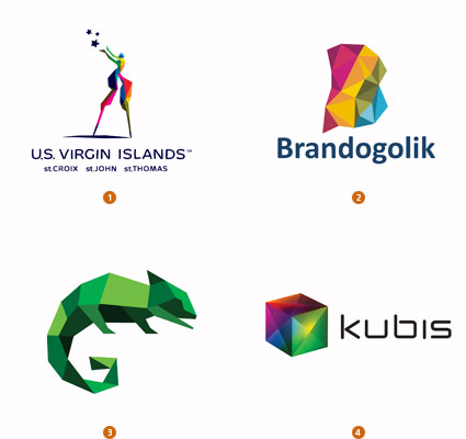
It should be no surprise that designers have again gone to the well of fine arts to draw upon technique for inspiration. As Pablo Picasso and Georges Braque discovered as the founders of the Cubism movement, there is a certain visual pleasure in the reduction of images down to their essence. In logo design, this same tenet applies, and a good marriage of concept and style emerge. Illustrating an image in a simple series of facets is really a glorified and more aesthetically pleasing version of an image reduced to a handful of pixels.
Illustration software which uses the Delaunay Raster process automatically creates spatial and color averaging that makes this technique broadly accessible. Illustrator Jonathan Puckey uses this process with stunning results on photographic images, and a similar animation style has become a signature look for a number of companies in their commercials. In identity design, hand rendering of these facets is pure cubist eye candy.
1. Iconologic, US Virgin Islands 2. Z&G, Brandogolik 3. Gardner Design, Graphic Impressions 4. Andrei Bilan, Kubis
Spores
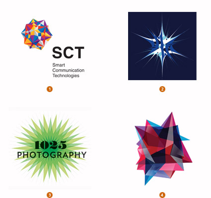
Microbial hitchhikers with all the tact of a sticker or cockle burr, these logos are a scaled-back version of a radiant star, and they typically start to take on three-dimensional qualities. They tend to be suspended in space or give the appearance of an underwater mine placidly floating in wait. (In fact, any of these logos could be a perfect candidate for animation.) Despite such dire comparisons, these logos still maintain an attractive, mathematical and mysterious quality that allows them to work well.
In some, the points emanating from the central object seem to have a tentacle-like quality, reaching out to convey a sense of connectivity and of serving multitudes. This same group of logos tends to exemplify how order can be applied to complexity. They show an ability to verge on the edge of chaos but still be held together with the perfection of nature. The aggressive surface of this style certainly requires a client that is able to be faithful to the complex nature of the forms.
1. MYDE, Smart Communication Technologies 2. KITA International | Visual Playground, KITA 3. Seamless Creative, 1025 Photography 4. BrandBerry, Anvexa
Ghosts
Attracting attention in a visual world is a designer’s most challenging task. Encouraging someone to really look is hard; forcing them to engage is harder to the nth degree. These Gaussian-like logos compel the viewer to take the second look if for no other reason than to confirm what they are seeing. The effect of the soft-edged translucent nature of these marks could well be considered a subtle act of confrontation.
That an image is appropriate to the objective is imperative, so this is not permission to just make any logo fuzzy. Remember, however, that there is mystery in leaving something to the imagination. The slow reveal or partial reveal can be much more engaging than the literal, all-out full reveal. The technique seems to have its greatest success if the image in question is obvious enough through silhouette that the viewer is not left confounded. Color is also a critical clue as we tend to identify objects by color before shape.
1. Julian Peck, Futbol California 2. Iconologic, America’s Natural Gas Alliance 3. Supersoon Good Design, Swiss Heat Transfer Technology 4. Strange Ideas, Shadow Farm
Tendrils
There is just the right amount of whimsy and human intervention in the draftsmanship of these logos to make them a pleasure to absorb. In past years, the LogoLounge trend reports have discussed logos with floral flourishes, dingbats and typographic elements bringing life to and skirting the edges of the mark. This group, however, helps place the Si Scott-inspired wisps of fancy into context. Far from being drafted with geometric perfection, these tendrils have a natural gnarl to their wandering, like a real vine.
Humans have been involved here, and that is the message. As beautiful as these logos are, they were not created by a soulless machine. They were created to glorify the brusque reality of imperfection. These marks are important because they show the importance of embellishment that customers associate as an above-and-beyond concept. At the same time, the hand-hewn message reinforces that this is an authentic offer, as different as a handwritten note is from spam.
1. Derrick Mitchell Design, LLC, Easthaven Baptist Church 2. RawType, Jacob’s Well 3. Sabingrafik, Inc., Rosenblum Cellars 4. Dale Harris, Blank Expression
Shift
Perfection is highly overrated even when imperfections are crafted perfectly. Transparent overlays of color often resembling a misregistered CMYK or RGB letterforms are the hallmarks of this trend, although significantly overlapping kerning and turning on the transparent mode qualifies marks for this category as well. Colors are usually clear and clean to allow the murky overlaps to be even more evident. The purposeful layering gives a nod to connectivity between different entities as they come together for a common good.
This trend is a bit of the celebration of diversity that shows a merging for common good. From another perspective, it could be a single entity splitting out into multiples. Because these are brighter, with elements of pure chroma colors, they tend to occur often in the entertainment or literature corridors. Though the images are static, the shifting elements give a sense of motion to the viewer. This instability draws the eye and can create the impression that these marks represent a work in progress.
1. Asta form, Sheriff Studio 2. Go Welsh, Penn State Architecture 3. Effusion Creative Solutions, musicplace.com 4. Liska + Associates Communication Design, Becker and Becker
Parts
This trend give insight into the comment “one of something ugly is ugly, but many of something ugly is beautiful.” Take any one of these ugly things—or, in this case, the iconic representation of your parts—and assemble these into an ideal construction. It’s an element in which many parts come together to create a common goal. From a distance, the image is the larger whole. But on closer inspection the image is revealed to be an amalgam of molecular images.
A diverse group of logos here show some very different takes in achieving similar objectives. “We the people form this nation” and create a map of the United States. A hundred or so divers come together to create a school of fish forming the outline of a shark, and yes, it is for a diving school. In each case, a nice visual balance was found to help the reader make the jump from the whole to the parts that came together to compose the result.
1. Kuznetsov Evgeniy, Russian Team 2. Ten:pm Media, Advanced Armament Corp. 3. Chris Rooney Illustration/Design, Ramsell 4. Hand dizajn studio, Diving Club Big White
Pixel
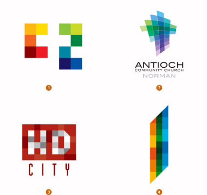
For your amusement, take a screen capture of the portrait favicon at the beginning of the address for www.marthastewart.com. Then park the minute picture of Martha in Photoshop and enlarge to fill your screen. This view of a 16 x 16 square of pixels as if through a microscope can be revealing. Nothing is as it seems once you knock it down to its atomic core. In the world of RGB, on-screen images, the pixel is the lowest common denominator. So these are logos that speak to their digital pedigree, but which are willing to say, “This is our very essence.”
Pixels seem to be a natural building block when dealing with digital products. They convey naturally the concept of many elements coming together to create a larger result. Because of the medium, the colors are often high in chroma and representative of diversity, but even in the HD City logo, you can see the effective use of the subtle range of tints even within a single color. There is no mistaking the association, but the challenge is to avoid being trite and discovering a new way to present a solution crafted using these tiny tools.
1. Eight a.m. Brand Design , C2 MEDICAL SPA 2. Eightday Studio, Antioch Community Church Norman Corp. 3. Gyula Nemeth, HD City 4. Andrei D. Popa, City Tower
Hexahedron
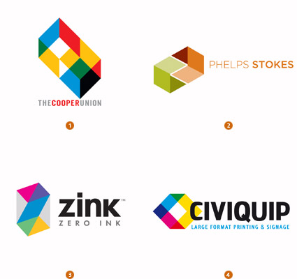
Stephen Doyle created such an intelligent design with his new identity for The Cooper Union, and the attending animation of the elements tumbling together helps further sell the concept. It’s just two cubes with three transparent, colored faces, representing the letters C and U. But a great sense of space is alluded to, which leaves the viewer with a sense you could navigate the space and imagine what this mark would look like from various angles. In short, it invites you to participate and become comfortable with it.
Other identities based on transparent cubes in various arrangements all have an implied sense of space and almost challenge us to interact with the marks. This may rise from the optical illusion aspect: The greater the participation level the design creates for the consumer, the more chances they have to buy into the ownership of the logo. The greater their level of ownership, the better the level of loyalty.
1. Doyle Partners, The Cooper Union 2. Kristin Spix Design, Phelps Stokes. 3. Tom Hughes Design, Zink, Inc. 4. Adstract Art, Civiquip Industries
Dust
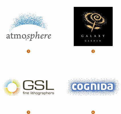
When you speak loudly and fail to modulate your tone, your voice becomes a monotonous drone. When you lower your tone and speak in a hushed whisper, every head in proximity will turn an ear to pick up the conversation. This group of marks understands the importance of subtlety. The whisper is created by a stippled effect that, depending on its density, creates different levels of tone within the logo. Yet because each speck is a hard-edged vector image, any appearance of color gradation is only an illusion.
Again the eye is drawn to these not just for the design but because they are confronting the viewer with something they have not seen before. The soft feathering of edges lends a different tactile nature to these marks that makes them unique. There is something a bit magical conveyed with this technique. The Galaxy Garden logo gives the feeling of some special charm being cast amongst the stars of the heavens, and the Atmosphere logo seems to isolate every particle we inhale.
1. RedBrand, Atmosphere Design House 2. Strange Ideas, Galaxy Garden 3. Tannehill Design, GSL Fine Lithographers 4. Identra, Cognida
Peepshow
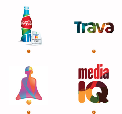
It’s the image inside the image that makes the sale. A pedestrian solution suddenly becomes a thing of beauty or interest if there is a great and compelling story showing through from behind the scenes. These logos tend to use vector-edged colored fields in their solutions that are lively and engaging. The contrast levels are kept minimal to avoid making the fill area visually jumpy. This adds a new field in which to play out concept or set the visual tone for a client, and it also establishes pattern as part of the visual vocabulary of the visual brand.
Iconologic successfully developed a series of Coca-Cola icons for use at the Vancouver Olympic Games. The iconic Coke bottle silhouette was fractured into fields that reflect the stacked stone logo of the games. These broken elements could have been rendered with simple color or gradation, but instead these areas use the blues and greens of the patterns developed for use at Olympic venues. It’s a nice sense of connectivity and a smart use of color.
1. Iconologic, The Coca-Cola Company 2. Dalius Stuoka, Trava 3. Wizemark, MonkVibe 4. X3 Studios, Media IQ
Festoon
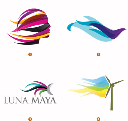
Anyone whose childhood included a springtime visit to a hardware store remembers the electric fans and window air-conditioners replete with tassels blowing horizontal at attention, thus assuring us that our own homes, too, could become a summertime den of arctic chill. These logos maybe are a bit less about the chill and a bit more about the blowing. Wind tunnels of streamers often in motion and flapping at gale force describe an invisible image underneath, or they may just be in full motion to define a pleasant breeze.
The key to most of these solutions is the tapering of the graphic element to a diminishing point and also the overlapping of the streamers. Generally, these are transparent so there is a color change where they overlap. There is a bit of free spirit and lack of control that comes in as part of the equation. Looking like untamed horizontal licks of flame, these designs convey a sense of joy or festivity that serve well in a lighthearted, feel-good application.
1. BrandBerry, TravelWorld.su 2. Burocratik – Design, Leite & Leite 3. Factor Tres, Gaby Luna 4. Rpd Design, Osorio City Hall
Stains
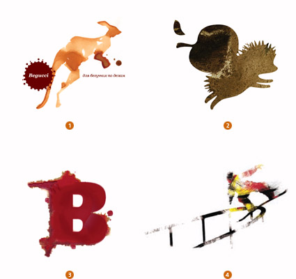
Imagine hand-drafting the great logos of our age on blotter paper with a juicy brush, and you start to get a feel for the logos in this genre. All are beautifully drafted and probably more than ever require great sensitivity to allow the blur of the technique to not detract too much from the essence of the image. Designers have been using stains on napkins from a coffee cup or a glass of burgundy for years, but this group moves beyond the simple spillage and plays out the art of the stain to new heights.
Paradox Box Design created a series of beautiful animal stains for the Begucci Cafe in Russia. Kangaroos, snails, cheetahs, walrus and more were each crafted in a caffeinated dark roast. The snowboarders shown here were also created as a series by Burton Snowboard. There is motion when a blurred edge comes into play; the grainy immediacy of these marks creates an impression of authenticity. It’s another example of breaking with traditional design technique and gaining that second and third look from the consumer.
1. Paradox Box, Rinat Tuhvatullin 2. Suprematika, Rucksack, the backpack online shop 3. Demographic Inc., Blood Brothers 4. Burton (Snowboards) Corp., Burton Snowboards
Burst

Fireworks no doubt win hands-down in a look-at-me contest. The accompanying audible boom is certainly a factor in drawing your attention to the flash, but the burst and emanating jets of light are visual adrenaline. What better centerpiece could you choose for an identity geared toward excitement, activity, or pleasure? All of these marks, and there were a number of them this year, deal with the imagery in their own unique way. But all of these still capture the fleeting image at its full glory.
Color and lots of it in every bright hue and full tilt spectrums were evident everywhere this year. These marks describe a penultimate moment and define it with motion, distribution and brilliant flashes. Trying to describe this effect in the fewest strokes is challenging, but the LaQuinta logo by LatinBrands and the Logistigo logo by Porkka Kuutsa are both great solutions with simplicity kept intact.
1. Sakideamsheni, Expo Georgia 2. Latinbrand, La Quinta 3. BrandBerry, 1945-2010 4. Porkka & Kuutsa Oy, Logistigo Oy
Wallpaper
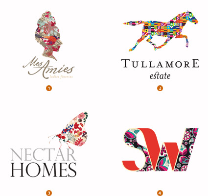
After watching monochromatic vines, flora, swirls, and flourishes incase anything and everything for the last several years, a truce to the over-embellishment seems to be closer than ever. But the decoration and fascination with print pattern has found a new incarnation and in full blazing color as well. Silhouettes and shapes are coming to life with substantial gusto, and they are relishing the attention. There is no apologizing for the color being used in this category.
A profile of a woman’s head is no more than that until you imagine what is inside the head. Blend the demure with the flamboyant, and her thoughts leap off of the page. A personality has been defined. These silhouettes don’t typically require much more than solid draftsmanship as the real story is being told with the panoply inside the shape. Obviously, any identity that relies this heavily on diverse color is going to find a challenge when reproduced in one color, but who lives in a one-color environment anymore?
1. Nectar Graphics, Mes Amies, Ladies Fineries 2. Koodoz Design, Tullamore Estate 3. Dirty Design, Nectar Homes 4. Kreativer Kopf, Schoen und Wider Druck
Box-Up
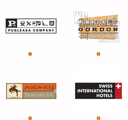
The use of text as part of a visual brand identity has become more critical than ever. Not just the name of the company must be spelled out, but there are other key points of importance as well—what the client makes, the motto, the location, the founding date, the point of differentiation. Even when this additional text is not included, the wordmark and the symbol at the very least require a lock-up to define a visual relationship between the two. A lock-up is always a balancing act that respects the needs of both elements. Enlarging the pair in an effort to make the wordmark larger can make the symbol too large. Reducing the symbol to a more modest size will make the wordmark illegible.
More designers than ever have taken a cue to capture the two elements together in a literal box. Take everything you need to communicate and pour it into an ice tray. No possibility of confusion for those that can’t respect an identity lock-up. It’s all there together in one package, no directions required.
1. Schwartzrock Graphic Arts, Pugleasa 2. Sudduth Design Co., Wilmington-Gordon 3. Fargo Design Co., Inc., Jackson Trading Co. 4. Sigg Design, Swiss International Hotels
Other Noteworthy Trends
 |
Extrusions: Flat outline forms, whether transparent or solid, that have been extruded mechanically to give dimension.Plastic A/Deksia Designs, Grand View University |
 |
Quilts: Imagine the surface of a logo covered with geometric transparent facets, layered together like the panels of a quilt.Niedermeier Design, Clear Bags |
 |
Melting: Points on a logo are allowed to drip and stretch away from the primary shape, as if gravity was temporarily turned off.Milou, rain bows |
 |
Contort: Graphics or halftone imagery is warped as if looking at a reflection in a fun-house mirror. Sometimes the original image is almost lost when contortion is compounded.Sparc, Inc., LaunchAgents |
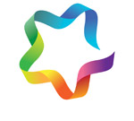 |
Rainbowed: Any use of the full-color spectrum rotation on a logo. Often this occurs when the mark creates a wreath-like effect and the color is able to circle back into itself.Rise Design Branding Inc., Star Creative |
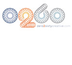 |
Spirogram: A mark crafted of many repetitive very thin lines, but not necessarily like the rosettes created by a Spirograph. The volume of lines helps create the mass of the logo.Interrobang Design Collaborative, Inc., Zero2sixty Creative |
Bill Gardner is principal of Gardner Design and creator of LogoLounge.com, a unique web site where, in real-time, members can post their logo design work; study the work of others; search the database by designer’s name, client type, and other attributes; learn from articles and news written expressly for logo designers; and much more. Bill can be contacted at bill@logolounge.com.
© 2010 Logolounge Inc.
Contact us if we can be of further assistance in your next logo project.


